
Collaboration with one UX designer and one developer
My role : UX Researcher + Designer
Steps to designing the new Craigslist app:
1-Define the problem that Craigslist web application currently has and establish the design principles we want to keep in mind
2- Investigate further opportunities
-Explored possibilities for solving the problem we found
3- Validate our new design solutions by testing our new design
4- Shipping the solution to our developer
While we didn’t know Craigslist's design principles, for our design project we decided to stick with four design principles to help design our app experience
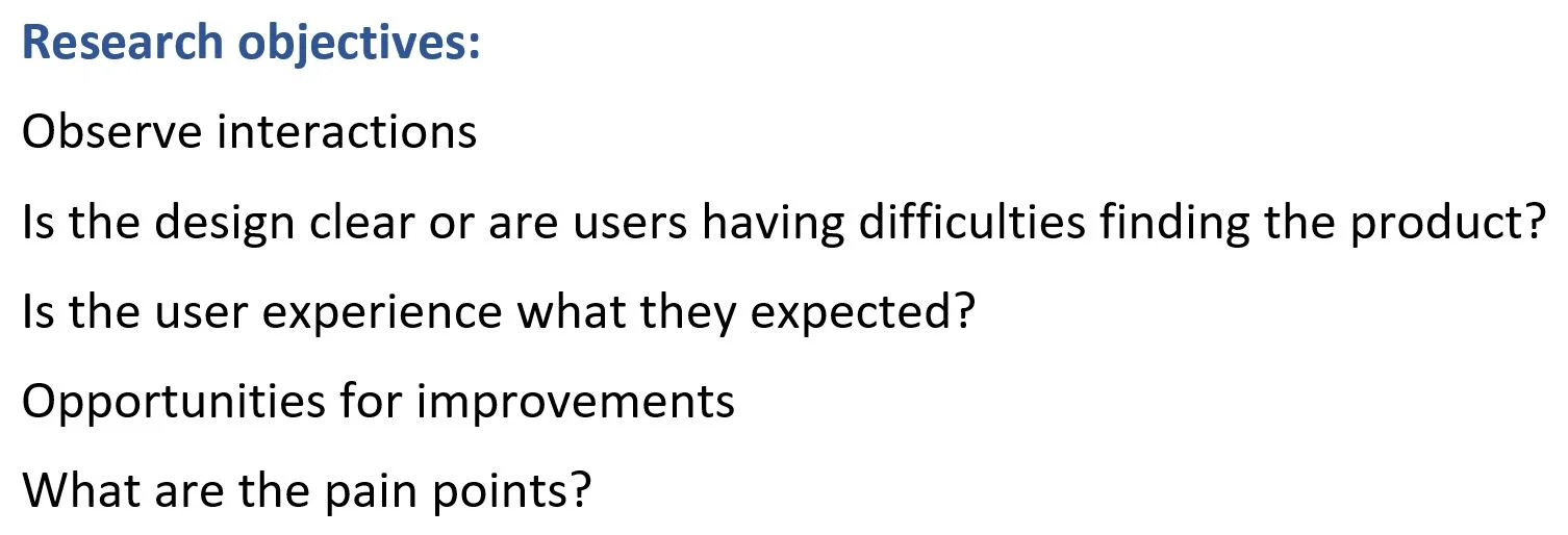
Understanding the user
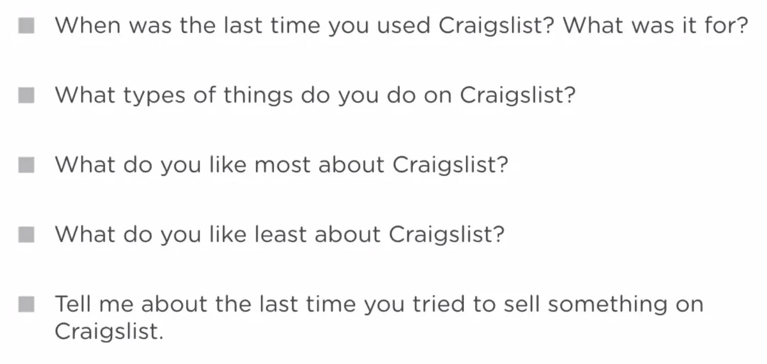
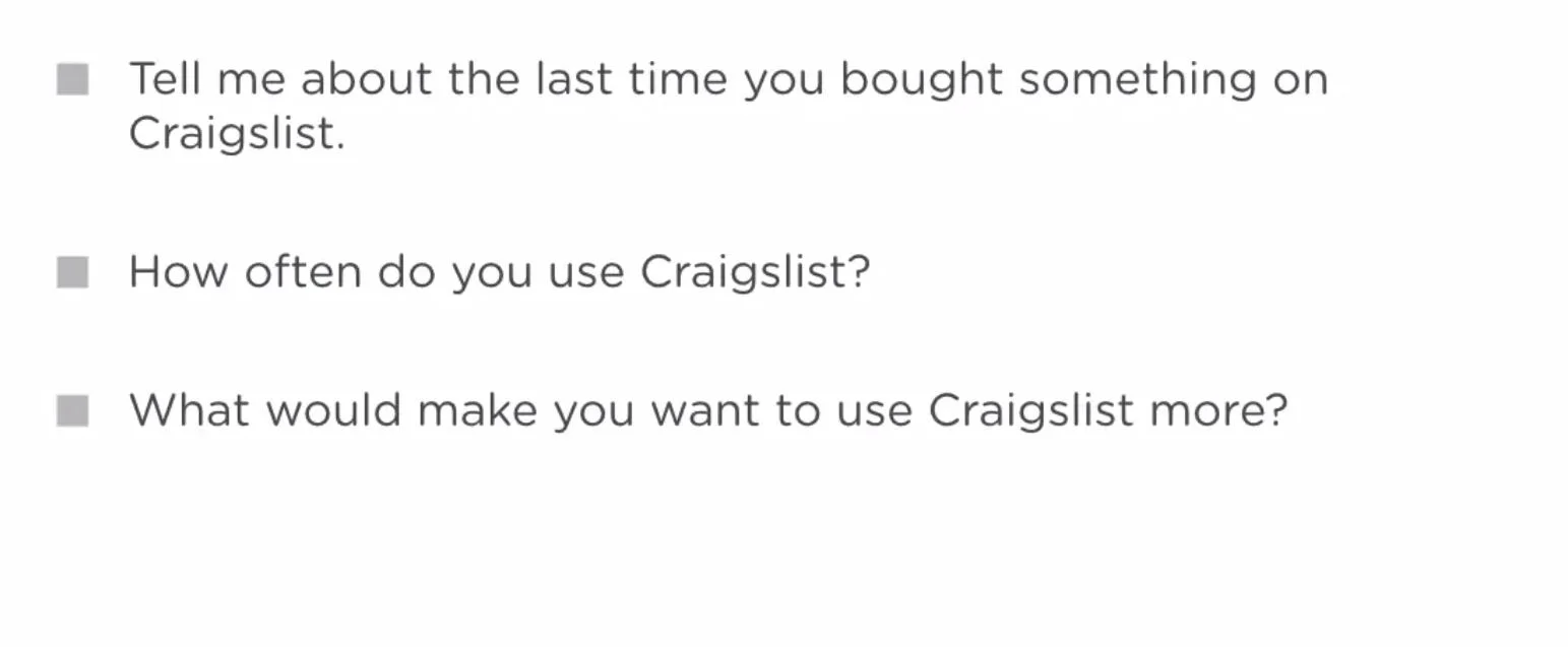
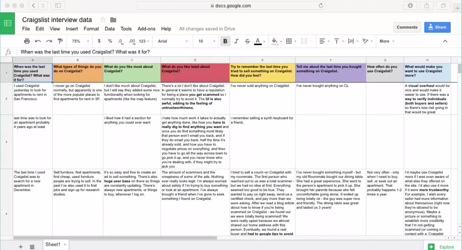
Talk to at least ten people who have used Craigslist, at least once recently, by interviewing them or sending out a quick survey with the questions below.
Ask them about their experience with using the product and gather any insights.
In Person Interview Questions we asked our users
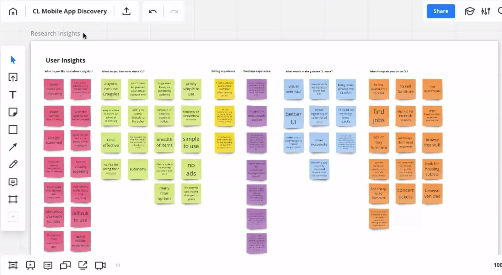
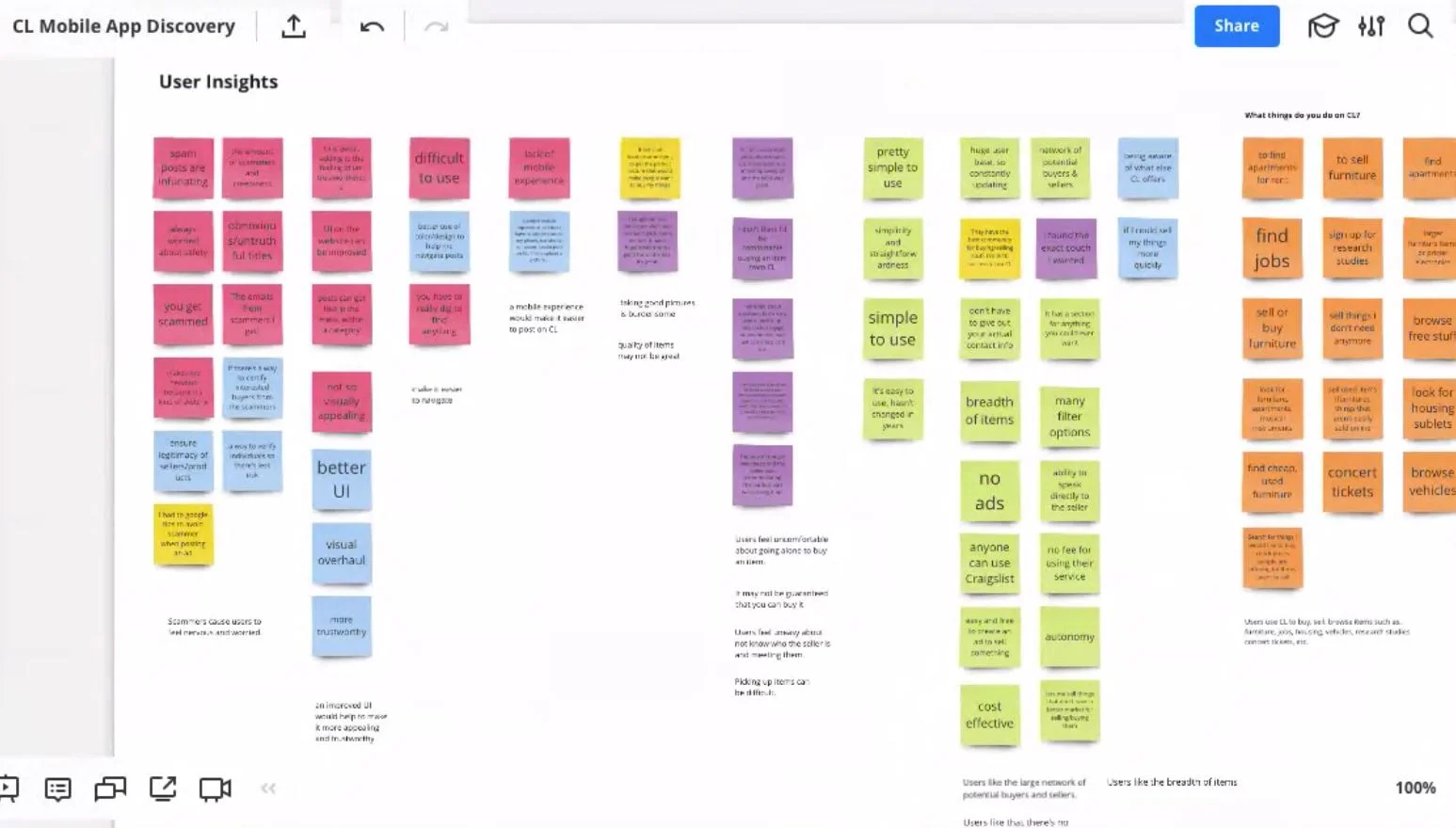
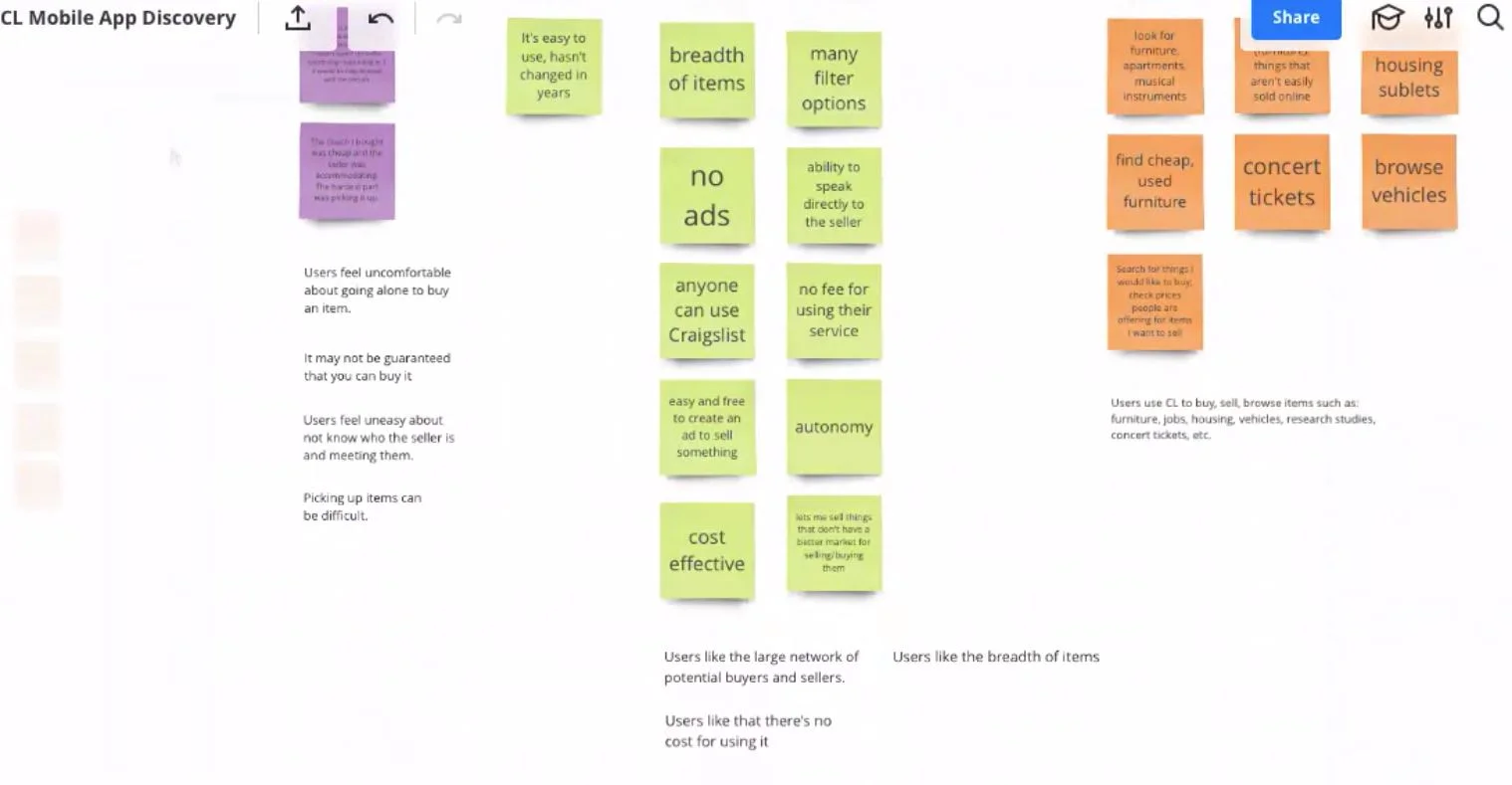
Using sticky notes is a great way to create an affinity map.
Affinity diagramming provides a complete picture of my research, showing trends, themes, issues, and areas of opportunity for improvement.
Once I gathered my research I organized and grouped the sticky notes based on similar insights or topics
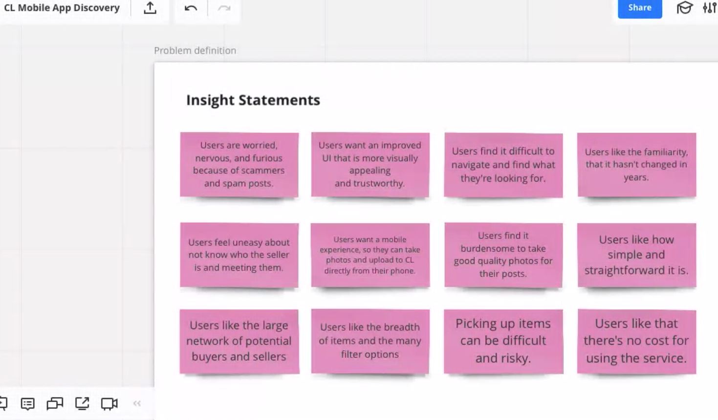
Made observations of which topics and insights were repeated the most, and jot down important notes. This helped me create the insight statements listed below.
Identifying and defining the problem was an important step that set the direction and focus for me and the rest of my team.
Since this was a project that did not involve Craigslist, we did not have to consider their goals, we only focused on the users goals. However, we did understand that in a real life scenario we would have to consider the company goals as well as the user goals to continue defining the best solution for both.
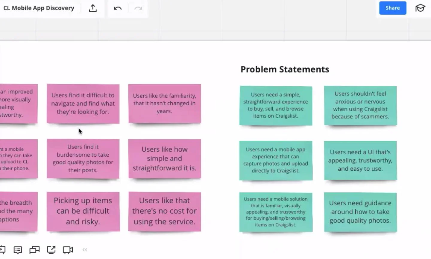
For our project, we focused on the problem expressed during our research.
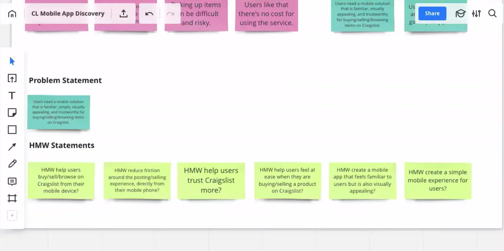
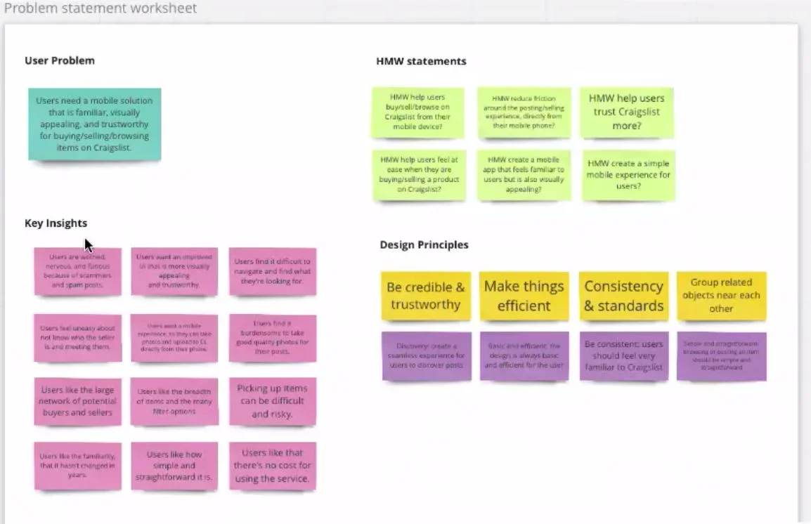
Users needed a mobile solution that is familiar, visually appealing, and trustworthy for buying, selling, or browsing items on Craigslist.
The H.M.W statements were created by rephrasing and framing our problem statement as several questions by adding how might we at the beginning and keeping the statements broad enough to allow for a variety of solutions.
I find it helpful to create a problem statement worksheet where I can view my problem statement, key insights, how might we statements, and design principles in one place. This helps me quickly refer back to my research as I begin the ideation phase.
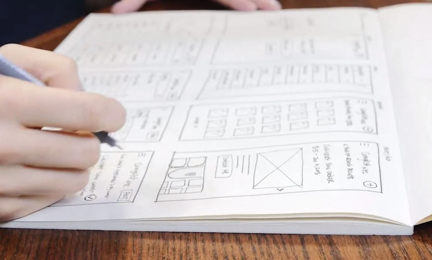
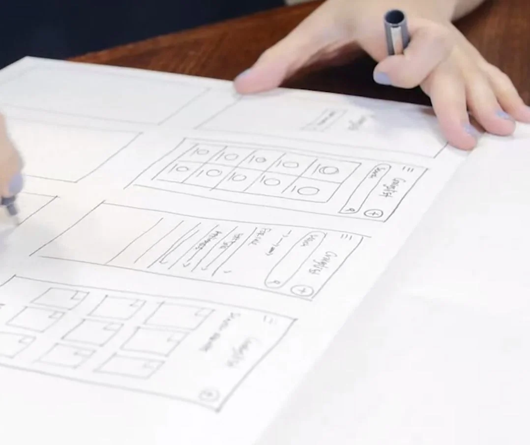
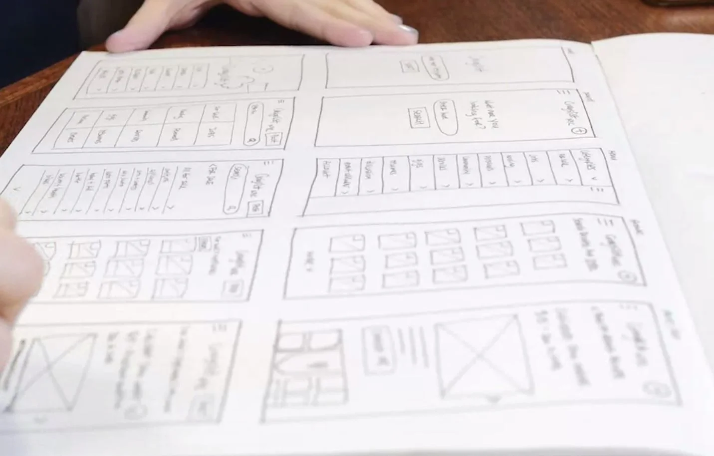
Wire framing and thinking about the UX flow, what screens I will need, the flow of the screens and how users are interacting with the app.
After going through a few rounds of sketching I start putting my ideas on paper and try to narrow down some options.
Some things that helped me narrow solution ideas is considering technical limitations or feasibility. This is where I had to communicate with the developer and find out the important technical limitations of my designs.
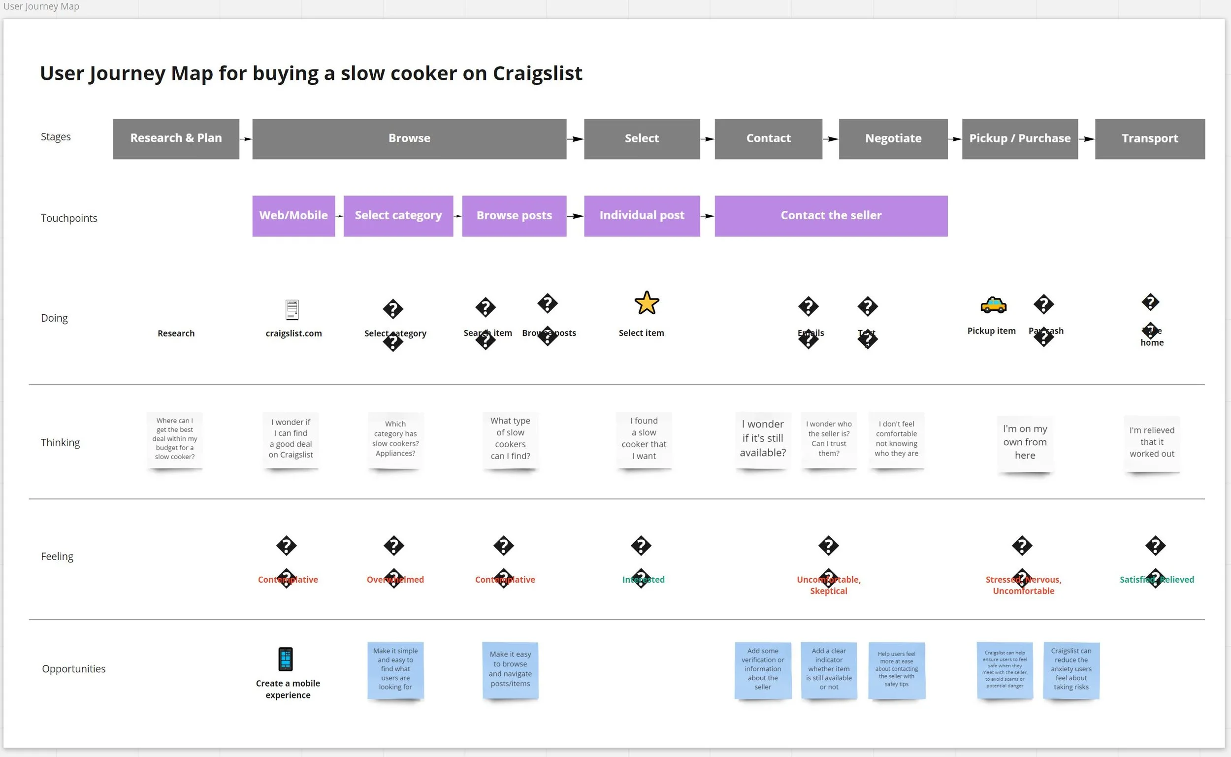
For our project, we created a fairly simple JourneyMap of our current Craigslist users, and their journey for purchasing a slow cooker on Craigslist.
Creating the user journey map helped us visually map out the user's journey while experiencing a product.
Mapping the experience from a user's perspective helped us see the big picture and identify pain points and strategic opportunities.
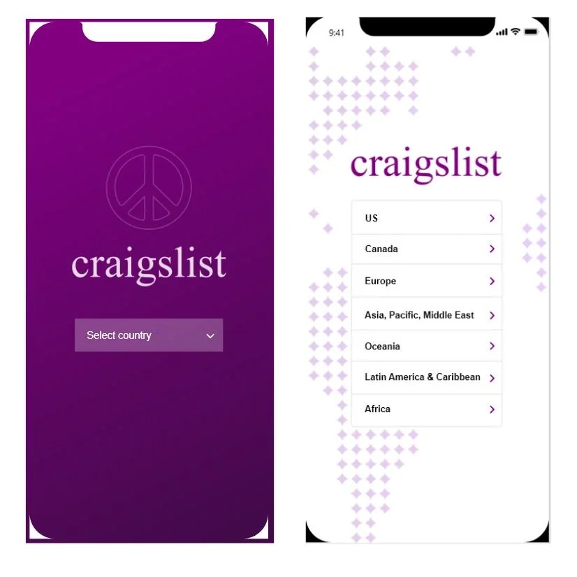
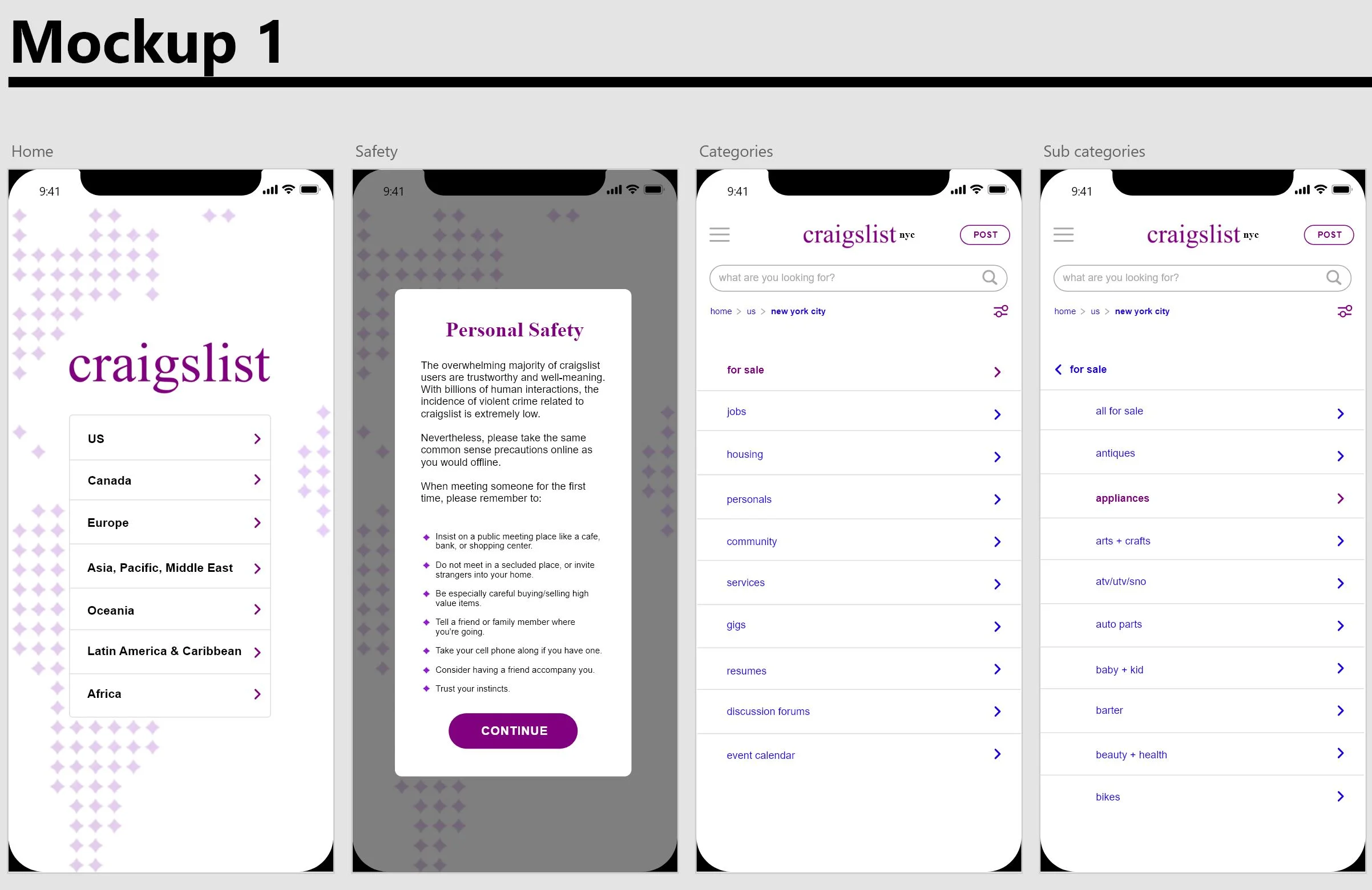
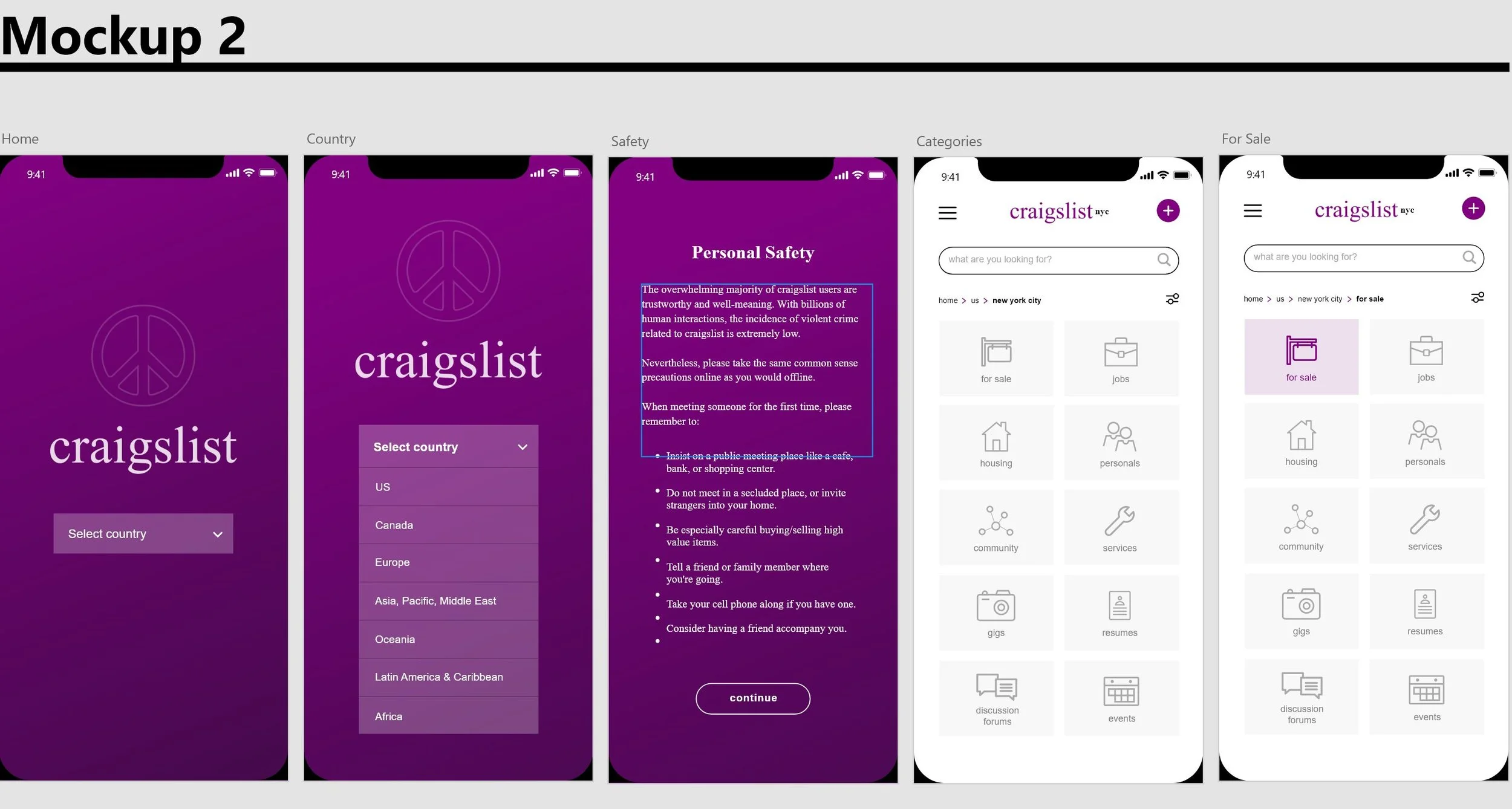
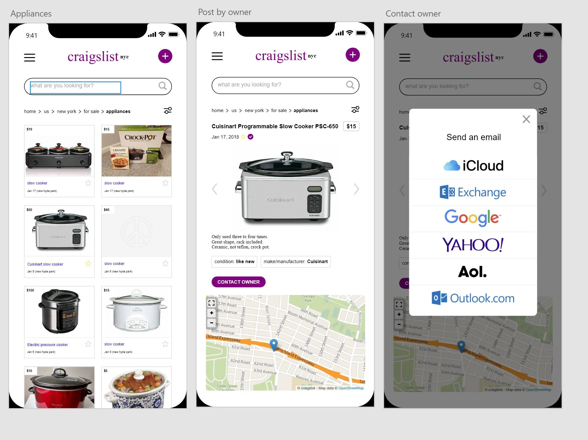
For this mock-up, I tried to make the home screen more visually appealing while using Craigslist brand colors and making sure that it still feels like Craigslist.
As I was thinking about how to increase the feeling of trust and safety for users, one idea was to bring the existing safety tips that are currently buried on the website, more to the forefront, while the user experiences the app.
On the categories page, I wanted to see what it would look like if we added icons to represent all the categories.
Does it enhance the browsing experience for users?
Does it bring more pleasure to users, or is it more confusing?
Does it still feel simple and straight forward?
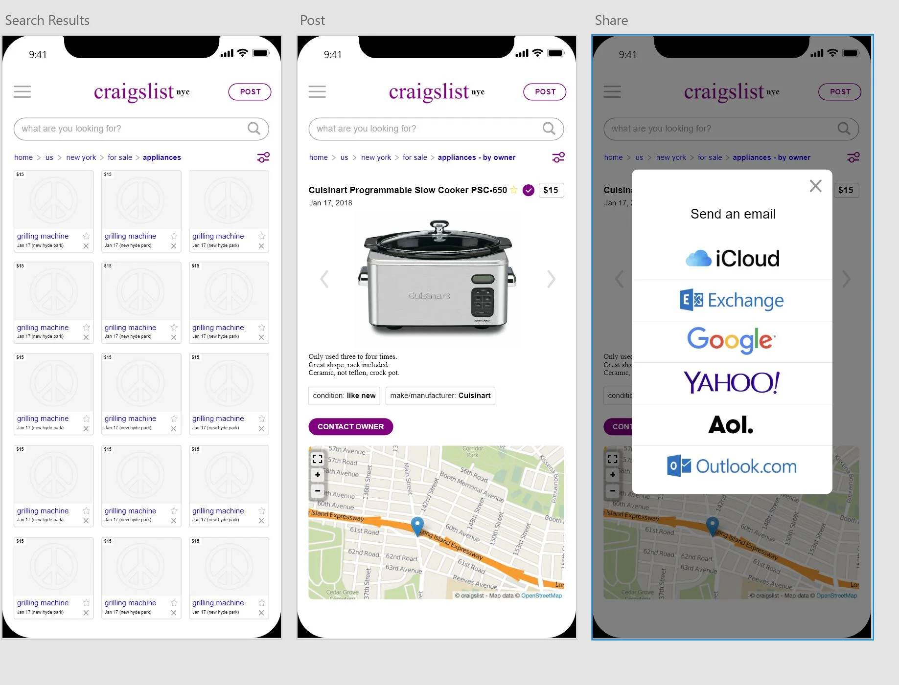
And lastly, on the search results page, I was thinking of some ways to make it easy and less overwhelming for users to discover and browse the post.
Perhaps by having larger images and more space between the thumbnails. Especially considering the size of the mobile screen. You don't wanna cramp any small thumbnails and make it feel overwhelming to users.
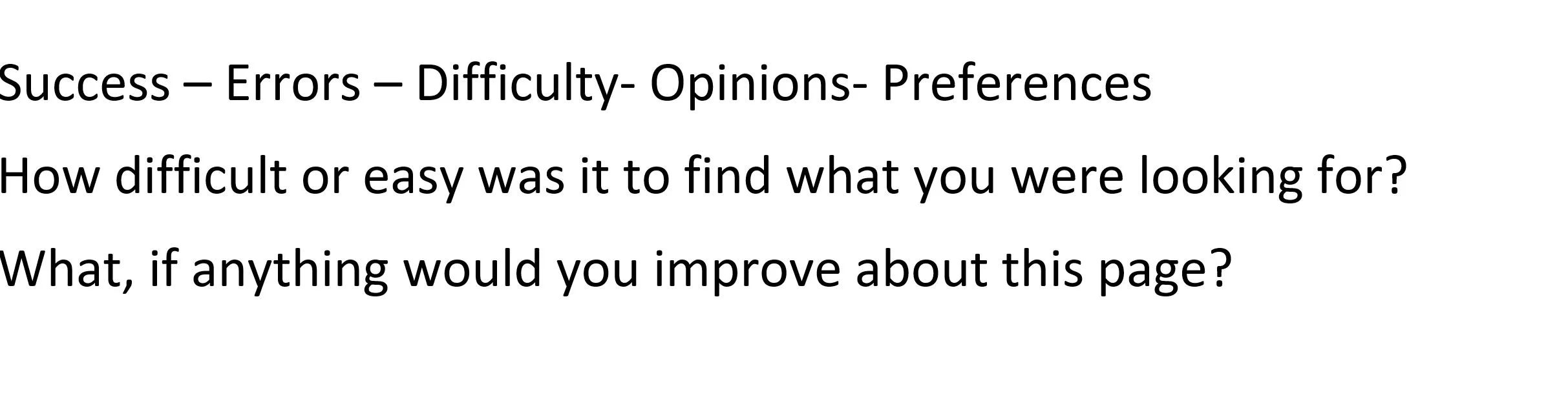
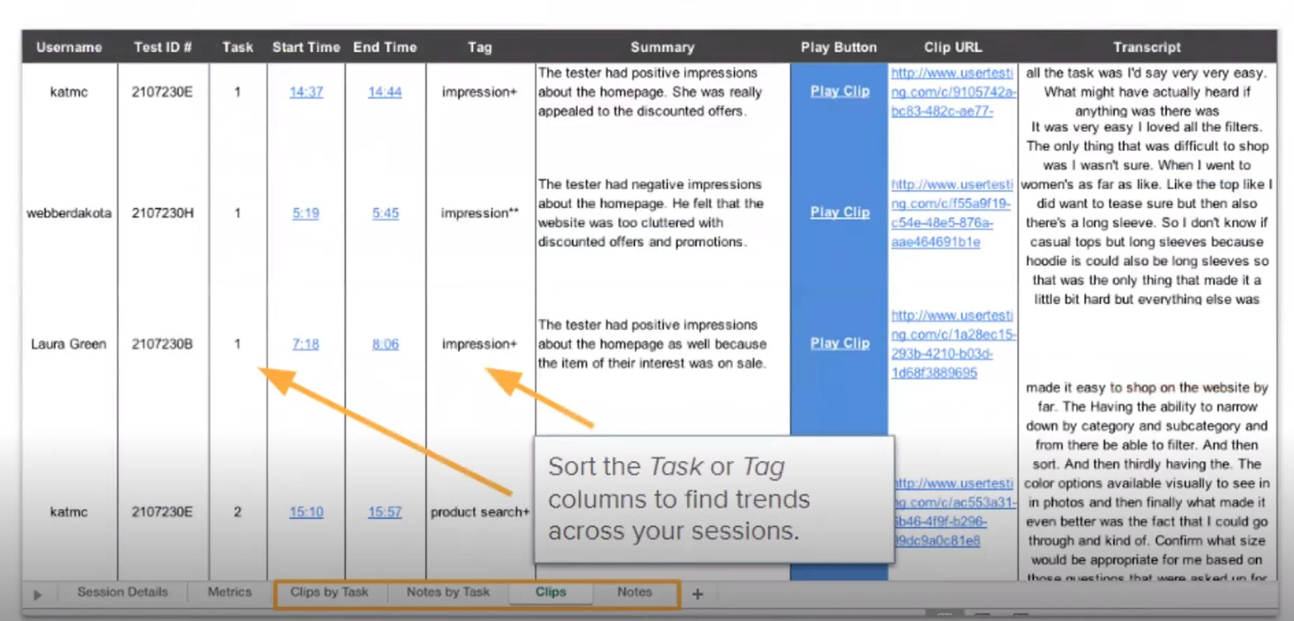
Created a user test script to test the final prototype with some of the same users I interviewed before I started designing.
Then, based on the results of my user test, I refined my design solution.
The process of testing and refining my design took a couple rounds.
Some of the patterns from talking to users were that while Craigslist users want a more visually appealing UI, they also like the familiarity of the Craigslist brand, which hasn't changed for so many years.
There's a sense of charm that shouldn't be lost by over-designing the app.
The last phase of our design process was to polish our designs and get our files ready for implementation.
This stage was depended largely on communicating and working with the developer and understanding what he needed from us to start coding the app.
Steps we took to deliver our designs:
1-Created an assets link in Adobe XD to share with the developer
2- Reviewed the designs with the developer to make sure all of the properties were included for development, such as :
- Specifications of the design
- Measures of distances, sizes, and styles
-Assets