A Beautiful Device With a Bad Experience
My Redesign for Google Nest Thermostat (Gen 1)
Smart doesn’t always mean usable.
When I first encountered the Google Nest Thermostat (1st Generation), I expected a sleek, seamless experience. Instead, I found myself in an oddly frustrating loop of spins, taps, overshoots, and second guesses. As a UX designer, poor usability doesn’t whisper to me; it screams.
This thermostat, meant to bring comfort, became a source of daily micro-aggressions against my time and patience.
So, I decided to do what designers do: redesign it.
What Went Wrong (And Still Is)
Let’s start with the obvious: the Nest Thermostat is sleek. Its minimal, circular design and turning dial are visually striking. The rotating mechanism is a cool concept in theory, offering a kind of futuristic slider experienc, but in practice, it’s not so cool for a lot of users.
Many reviews echo the same issues I faced: overshooting the temperature, uncertainty when selecting a mode, and frustration when diving into nested menus. The elegance of the design doesn’t excuse the lack of usability for everyday people.
Let’s get this straight: there is an app. But not everyone wants to pull out their phone just to change the temperature. The physical device still matters, especially for guests, children, seniors, or anyone who doesn’t have the app installed.
The original Nest design relies solely on a dial interface with minimal on-screen guidance. You rotate to select, press to confirm, and dive into a series of menus for even the simplest tasks.
Want to switch from Heat to Cool? Spin and tap through multiple screens.
Want to turn it off? Good luck finding the option quickly.
Want to know what you’re doing without squinting or guessing? Keep hoping.
No clear affordances. No tactile confirmation. No real-time clarity.
My Redesign Concept
I imagined a version that embraces affordance, inclusivity, and speed.
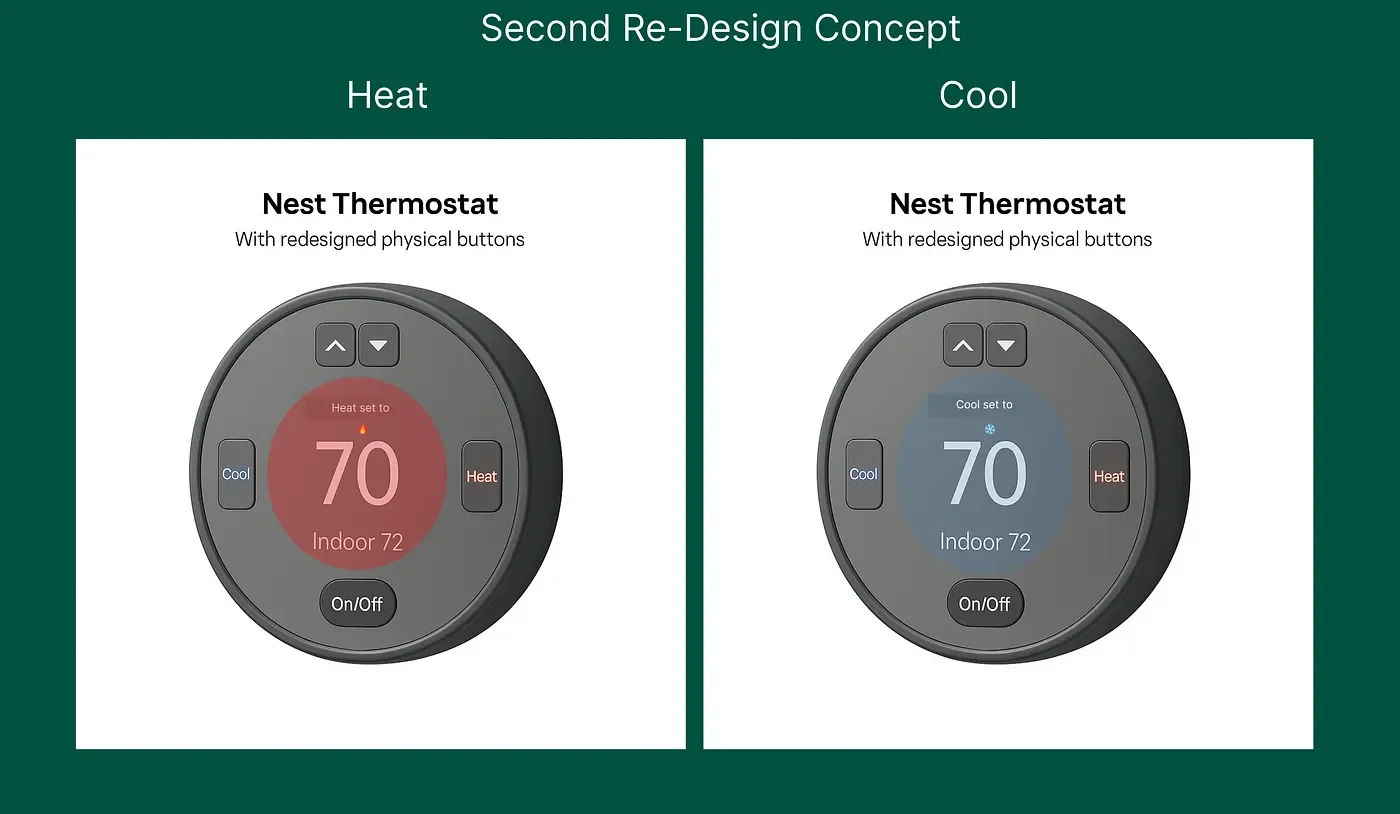
Separate buttons for Heat and Cool (labeled and color-coded)
Accessibility options like voice announcements and large fonts
From the original Gen 1 Nest interface to two progressive redesign concepts.
The first introduces basic labeled side buttons; the second fully embraces a physical-button layout with clear Heat/Cool/On-Off affordance.)
No guessing. No digging. No app required.
My quick and dirty design visual of what the new designs could look like:
Press enter or click to view image in full size
Press enter or click to view image in full size
But What About the 4th Generation?
Google’s 4th Gen Nest Thermostat does improve some things:
But usability at the physical level? Still neglected.
The dial remains your only method of interaction. There are no separate buttons. No haptic feedback. And while the new screen looks beautiful, the core task flows are still buried behind too much spin-and-tap.
The app has also migrated to Google Home, which many users report as a downgrade from the original Nest app. For all its upgrades, the experience still isn’t inclusive, intuitive, or immediate.
Would more buttons require more wiring or battery power?
Not necessarily. But possible.
Physical buttons can be implemented using low-power tactile switches that add minimal draw on the battery. Many modern thermostats already use capacitive or pressure sensors, and adding a few labeled buttons wouldn’t require significantly more energy, especially if they’re not backlit 24/7.
As for wiring, Nest thermostats already work with or without a C-wire (common wire), and power-sharing is built in. The existing board could likely support button inputs with minor reconfiguration.
In other words: yes, it adds a bit more complexity — but no, it doesn’t break the system or require a bulky redesign.
And the usability gain? That’s worth every line of circuitry.
Why This Matters
Design isn’t just about aesthetics. It’s about how things work and how they make people feel.
The Nest Thermostat looks modern, but it fails many of its users, especially those who need direct, clear, and responsive interaction. Relying on an app-first approach ignores the physical space where real interaction happens.
What If the Nest Worked Like a Phone?
Let’s imagine another version of the Nest Thermostat, one that feels as natural to use as your smartphone.
A touchscreen interface you can swipe or tap instead of turning and pressing.
A customizable home screen with preset modes like Sleep, Away, or Fan Only.
Voice interaction and feedback like, “Cooling to 72°.”
Visual cues, gesture controls, and icons that make sense at a glance.
This approach wouldn’t just look smart; it would feel smart to use. It would honor the expectations people already have from their phones, tablets, and even car dashboards.
It could also be more scalable, allowing new features to be added through software, not hardware upgrades.
Final Thoughts
My hope is that future iterations of Nest, or maybe some brave competitor, take these UX considerations seriously. I’m not against smart tech. I just believe it should be smart and usable.
If my thermostat makes me pause, squint, or open my phone every time, it’s not solving a problem. It’s creating one.
Thanks for reading. And to the teams at Google and Nest
this isn’t a complaint; it’s a design love letter. I’m passionate about usability and accessibility. If you’re ever looking for insight, feedback, or collaboration, I’d be more than happy to contribute.
Let’s make smart homes a little smarter for everyone.
By Marti
Good design is invisible. Bad design is unforgettable. Nest’s thermostat left an impression, so I redesigned it with empathy, clarity, and usability.