Treasury Cube — Enterprise Website Redesign
Led the UX architecture and visual redesign of Treasury Cube’s public website under a two-week conference deadline.
Defined information structure, aligned stakeholders around content simplification, created developer-ready user stories, and delivered iterative prototypes that shaped the final live experience.
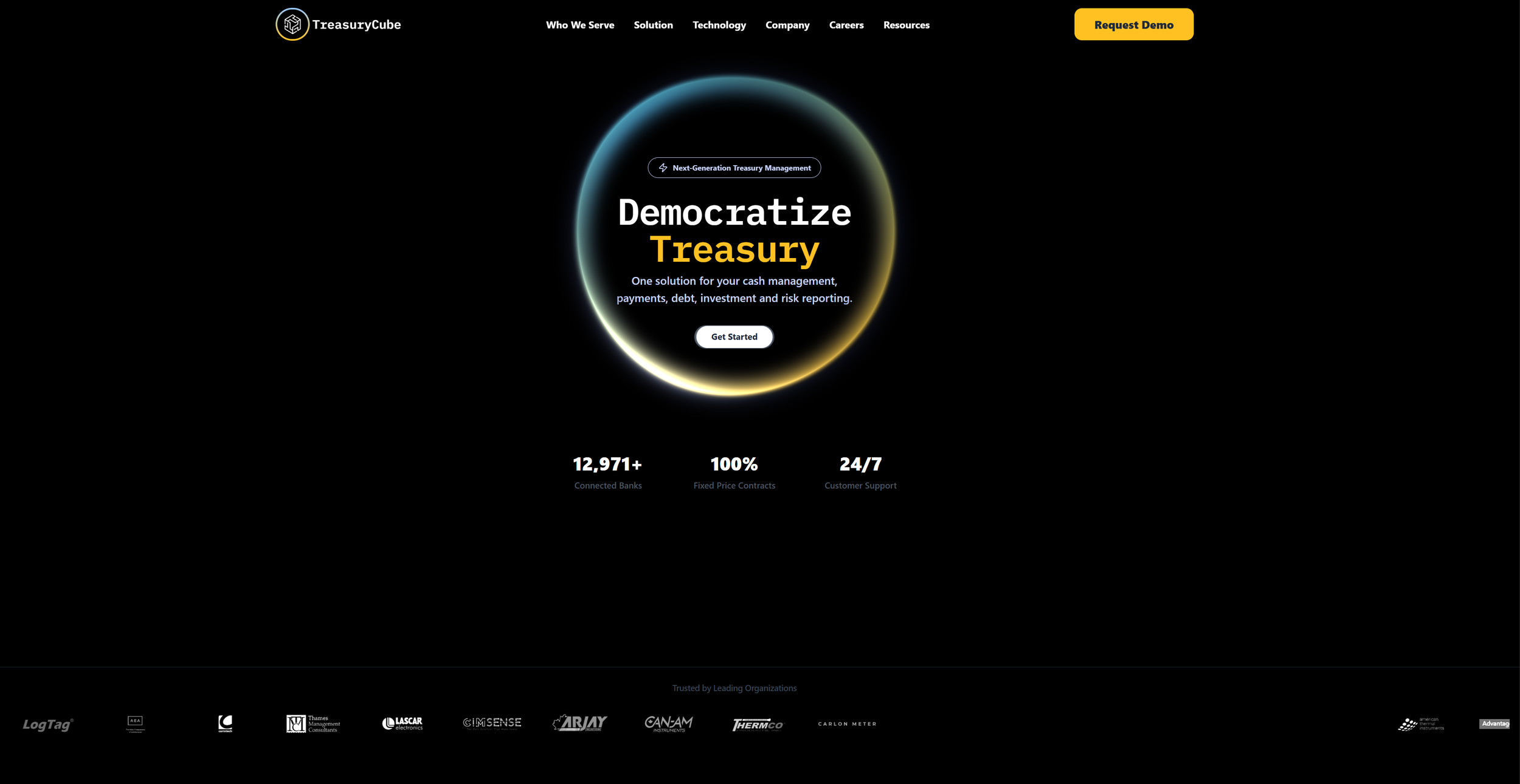
Treasury Cube
Redesigning a complex fintech website in two weeks
My Role
UX & Brand Designer
Led research, information architecture, and visual redesign for the external website.
The Problem
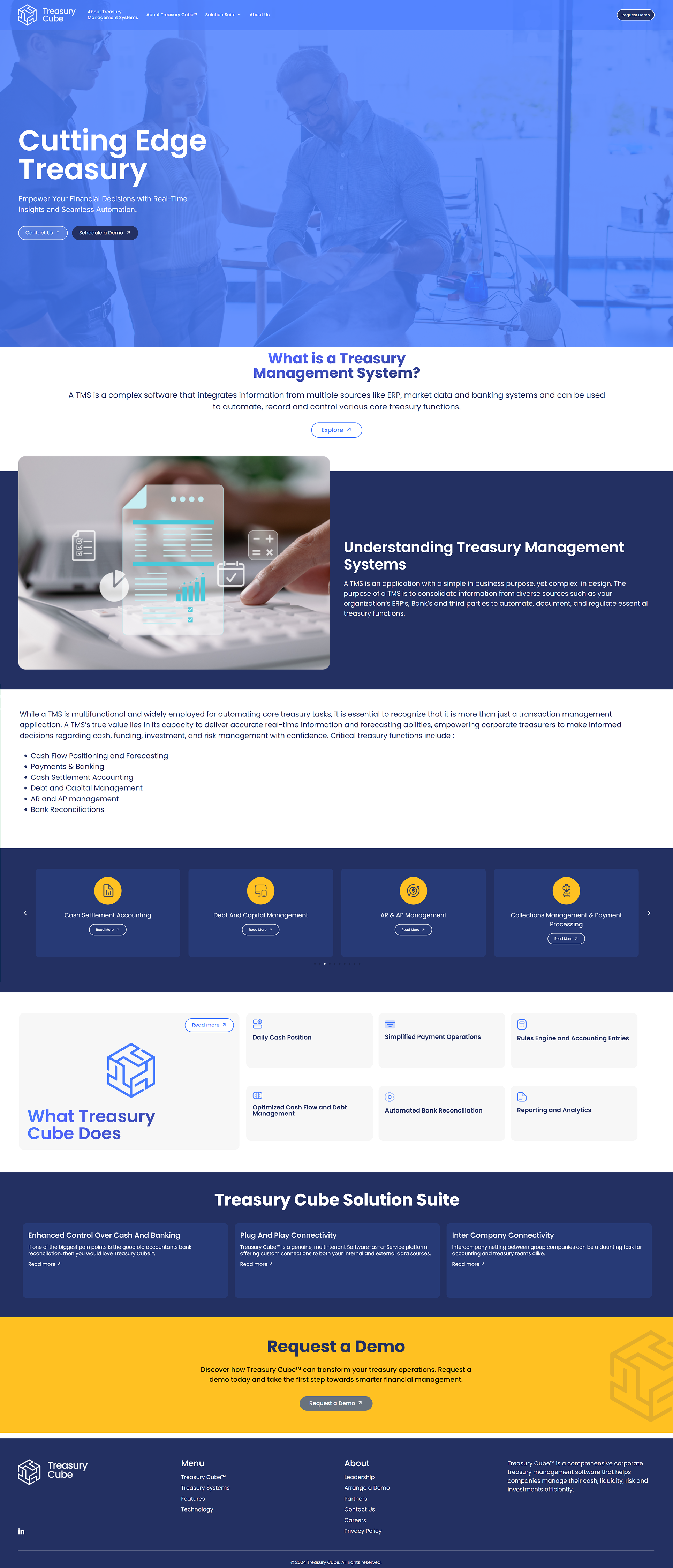
TreasuryCube’s external website had grown complex and difficult to navigate.
As the company expanded, content increased without clear hierarchy, making it hard for users to understand the product or find what mattered.
The team needed a full website redesign in two weeks — without losing critical information.
How I Enabled Fast Development
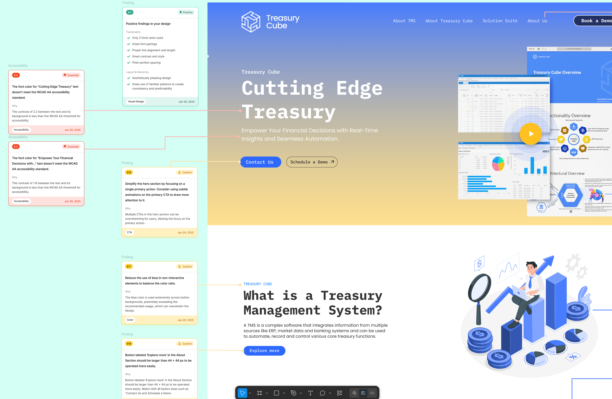
To keep momentum high and reduce development risk, I paired design with clear execution artifacts.
Designed and iterated screens in Figma
Built interactive prototypes using Canva Code so stakeholders and developers could experience real interactions before build
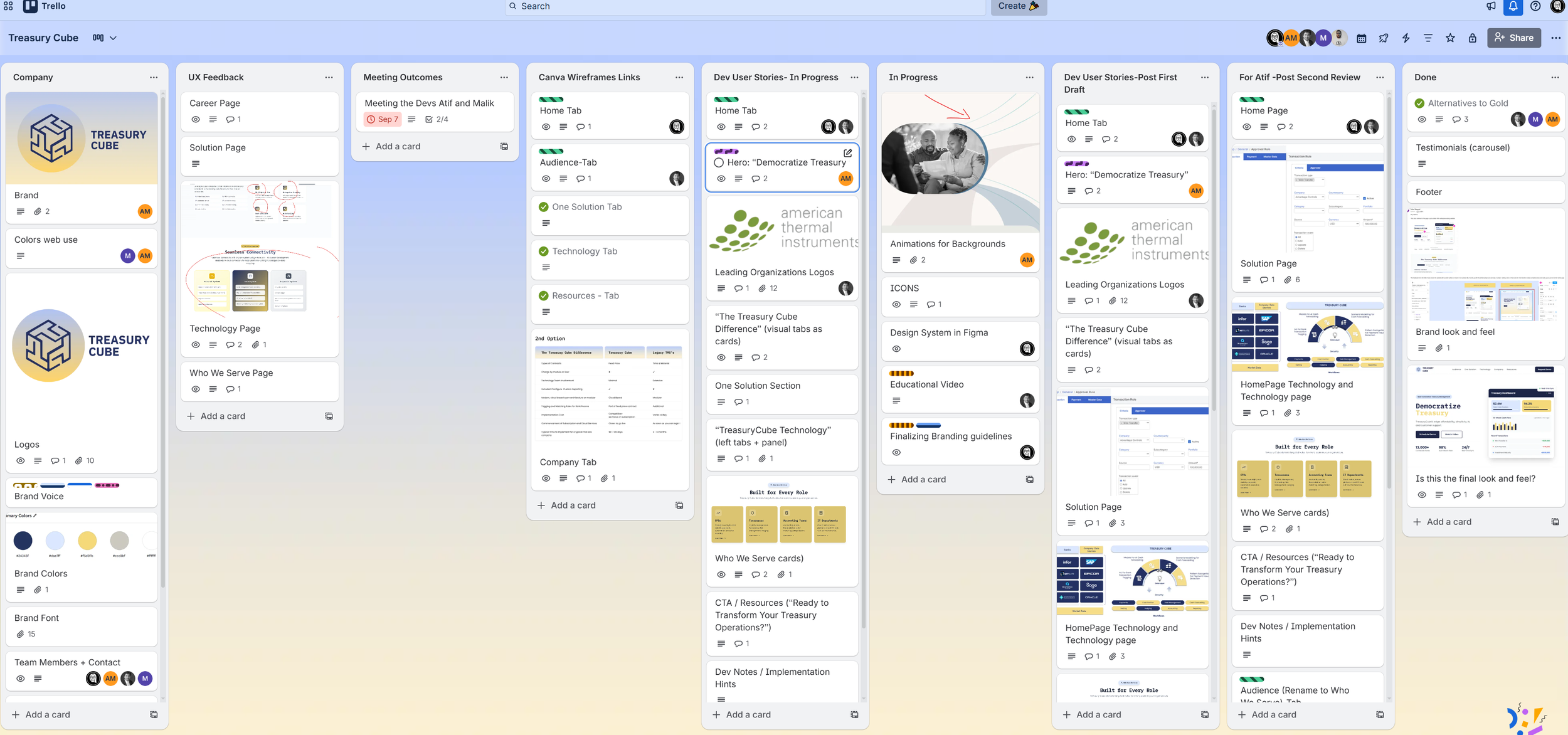
Created a Trello board from scratch to track scope, feedback, and progress
Wrote user stories for each screen to clearly define behaviors, states, and interactions for development
Refined and updated the logo in Adobe Illustrator to align with the new visual direction
This approach helped the team make decisions faster and allowed developers to build with confidence.
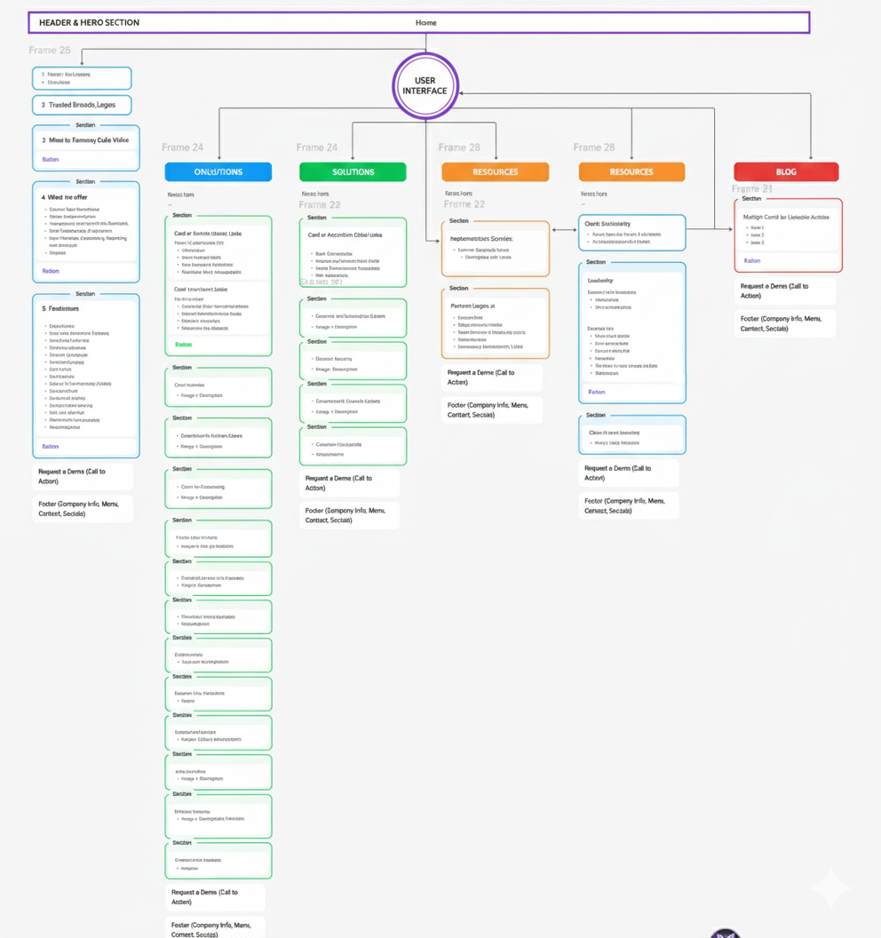
The Process
Clarified site architecture for a large, information-dense fintech product
Designed and iterated the website in Figma under a tight timeline
Collaborated with stakeholders and developers using rapid, interactive prototypes
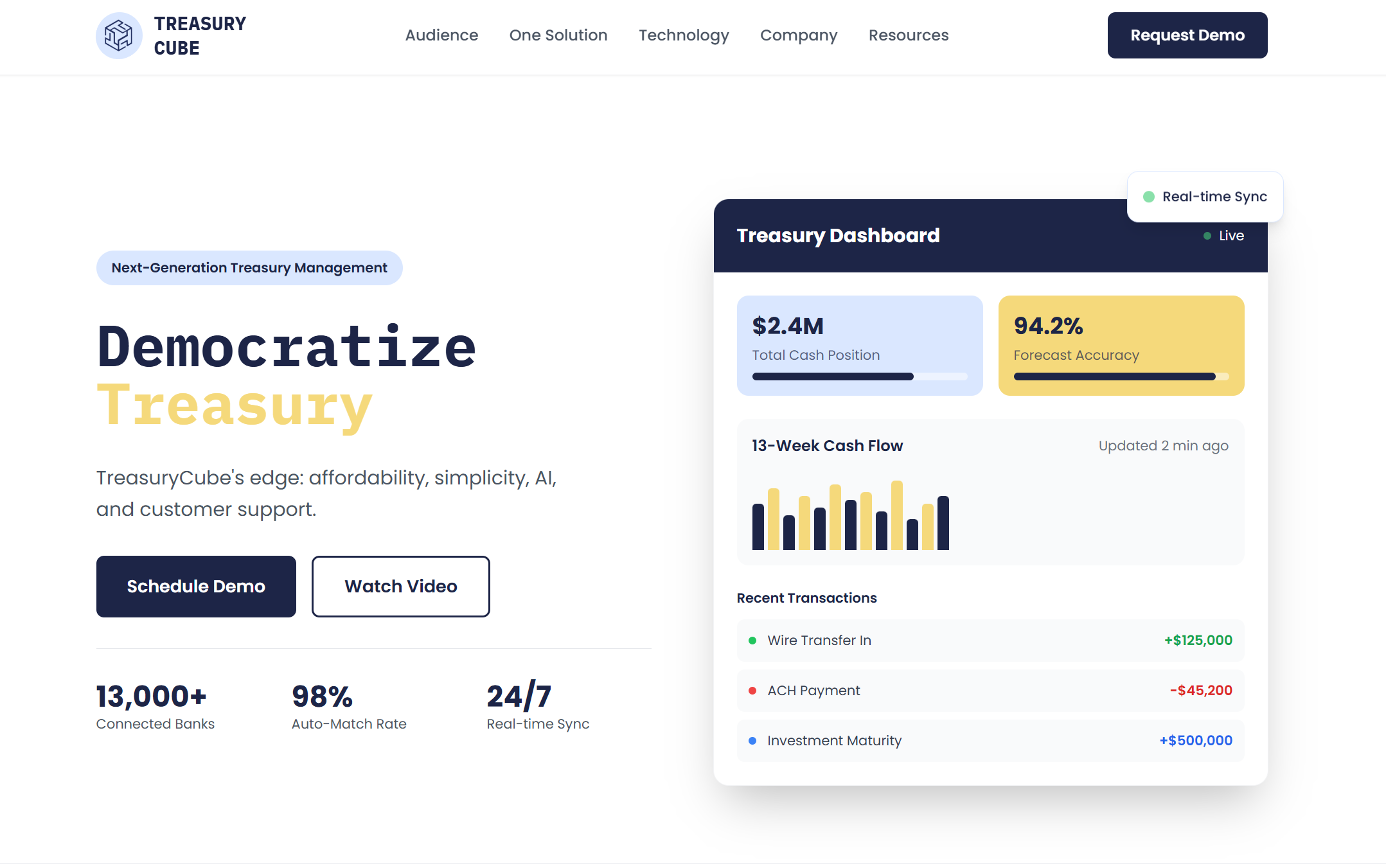
The Outcome
Full external website redesign delivered in 2 weeks
Clearer navigation and content hierarchy
Scalable structure for future growth
Why It Matters
This project demonstrates my ability to simplify complex systems, prioritize under pressure, and deliver usable solutions quickly in enterprise environments.
Problem → Approach → Outcome (Condensed)
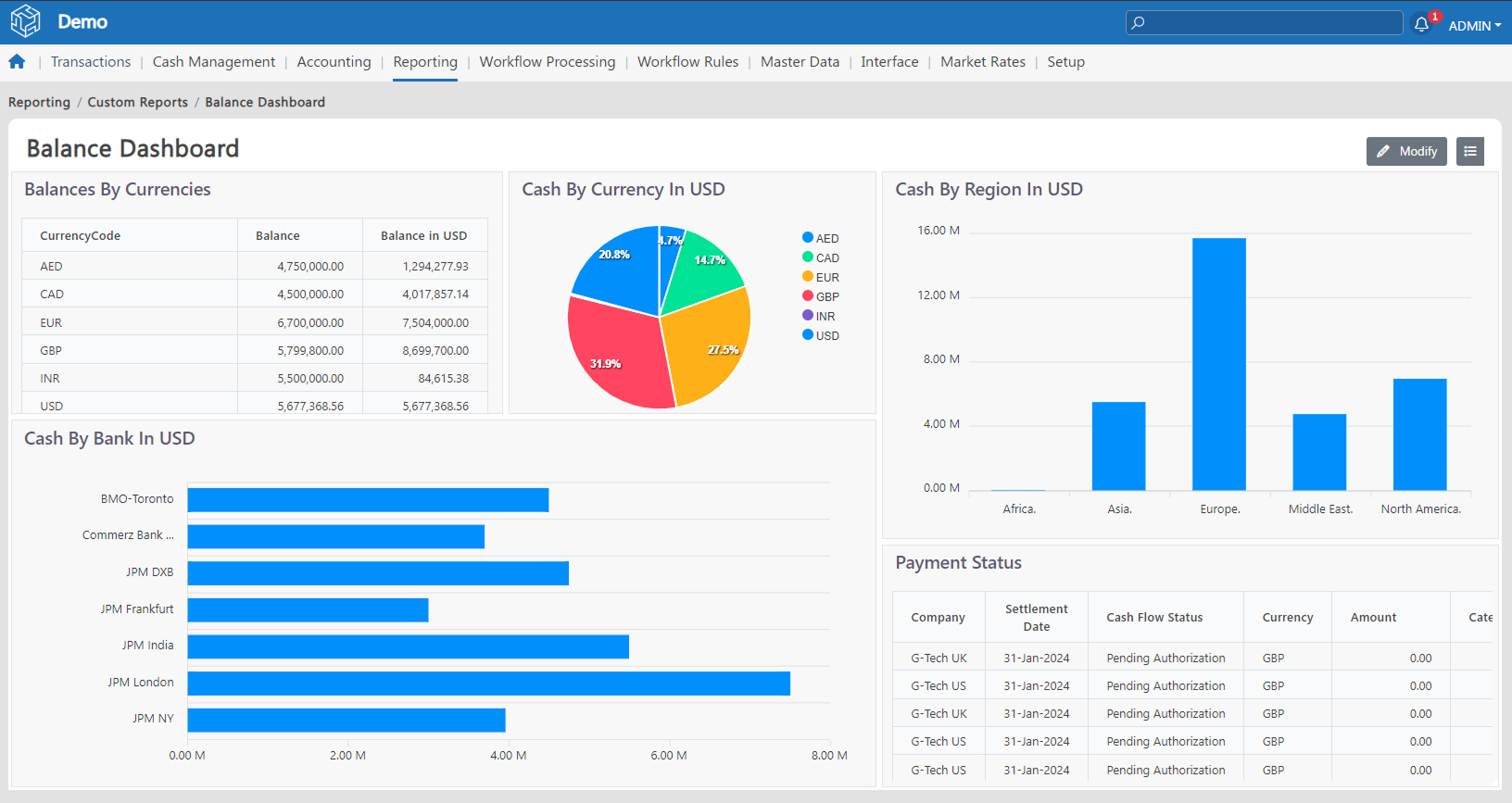
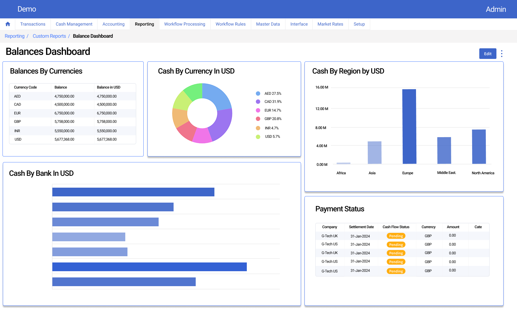
The original dashboard surfaced critical financial data but lacked visual hierarchy and consistency, making it harder for users to scan and prioritize information.
I restructured the layout, refined the color system, and standardized chart patterns to reduce cognitive load and support faster, more confident decision-making for treasury users.