TREASURY CUBE CASE STUDY
Redesigning an Enterprise Fintech Website
Simplifying complex product information and delivering a redesigned website under a two-week conference deadline.
UX Designer & Business Analyst / Treasury Cube / 2 Weeks
Making a complex fintech product easier to understand
THE CHALLENGE
Treasury Cube's public website contained extensive product information without a clear content hierarchy.
As the business evolved, information became increasingly difficult to navigate, with overlapping content and opportunities for consolidation.
Information overload
Extensive product content made it difficult to identify key information.
Duplicate content
Similar information appeared across multiple sections.
Tight deadline
The redesigned website needed to be ready for an upcoming conference in just two weeks.
The redesign needed to simplify the experience without losing essential product information.
I led the UX design and delivery process
MY ROLE
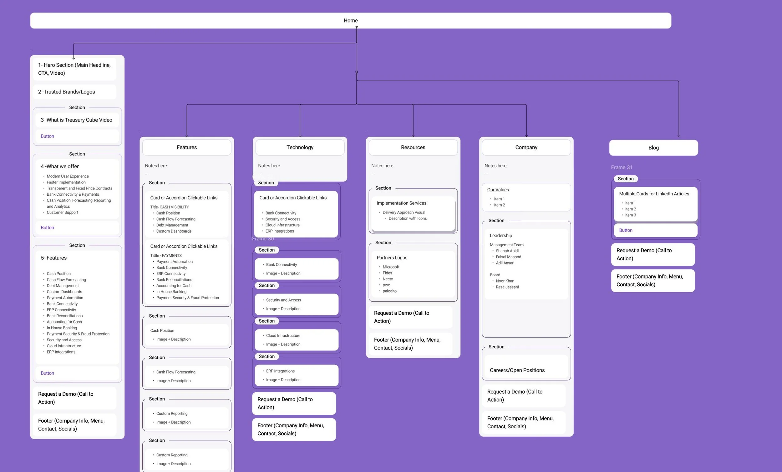
Information architecture & UX design
Reviewed existing content and identified opportunities for consolidation.
Restructured website navigation and content hierarchy.
Designed page layouts and visual experiences in Figma.
Created and refined multiple design iterations.
Business analysis & collaboration
Translated business needs into developer-ready user stories.
Worked directly with the CEO to align design decisions with business priorities.
Collaborated with the developer on implementation and feasibility.
Used interactive prototypes to gather feedback and guide revisions.
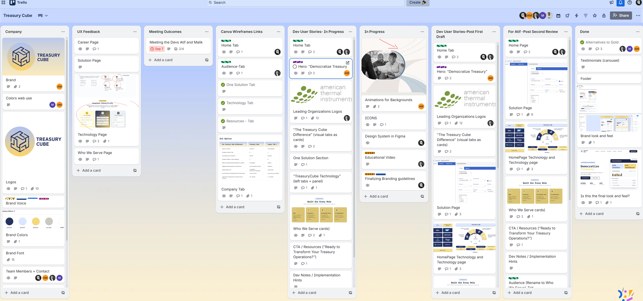
I served as the bridge between business requirements, user experience, and development.
DISCOVERY + CONTENT ANALYSIS
Understanding what needed to stay, change, or go
With only two weeks available, I focused discovery on understanding the existing website, business priorities, and product information.
Content review
Identified duplicate information, overlapping sections, and opportunities to simplify the website.
Stakeholder alignment
Worked with the CEO to understand the company's priorities, essential messaging, and conference deadline.
Information architecture
Reorganized the content into a clearer structure that made the product easier to understand and navigate.
Approach: Rapid content analysis and stakeholder discovery rather than a formal user research study
INFORMATION ARCHITECTURE
Simplifying the website's structure
The existing website contained extensive product information that needed a clearer hierarchy.
I approached the redesign by identifying related content, consolidating overlapping information, and establishing a more logical organization.
Key design decisions
01
Reduce duplicate information across pages.
02
Establish clearer navigation and page hierarchy.
03
Organize content around distinct product topics.
04
Create a structure that could accommodate future content.
Goal: Help visitors understand Treasury Cube's offering without navigating unnecessary or repetitive content.
DESIGN ITERATION
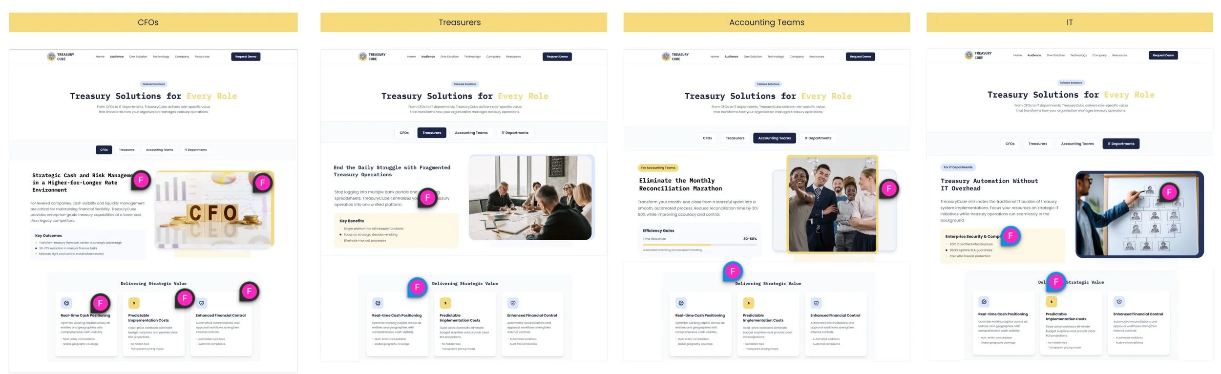
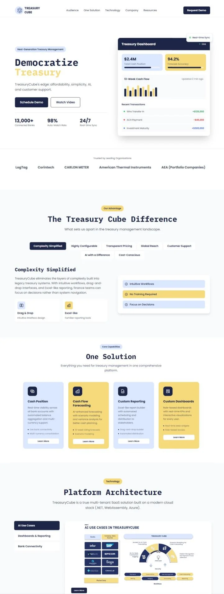
I created the redesigned website experience in Figma, focusing on clearer layouts, consistent visual patterns, and a simplified presentation of complex information.
Moving from Figma to interactive feedback
Figma design
Developed the website's layout, hierarchy, and visual direction.
Interactive prototyping
Used Canva Code to create an interactive version of the design for stakeholder review.
Feedback & iteration
Reviewed prototypes with the CEO and developer, incorporated feedback, and refined the experience throughout the two-week engagement.
Rapid prototyping helped turn design discussions into concrete decisions.
CROSS FUNCTIONAL COLLABORATION
Aligning business, design, and development
Working directly with the CEO and developer required clear communication and fast decision-making.
CEO / Business stakeholder
Aligned on business priorities, content requirements, visual direction, and feedback.
UX Design & Business Analysis — My role
Defined the information architecture, designed the experience, documented user stories, and coordinated revisions.
Developer
Collaborated on technical feasibility, implementation, and translating approved designs into the working website.
My focus was keeping the experience coherent while ensuring decisions were practical and achievable within the deadline.
DESIGN DECISIONS
What changed in the website experience
01
Clearer navigation
Reorganized the website's information structure to make content easier to locate.
02
Reduced duplication
Consolidated overlapping information to create a more focused experience.
03
Consistent design patterns
Established a more cohesive presentation across the website.
04
Improved visual hierarchy
Redesigned layouts to make complex fintech information easier to scan and understand.
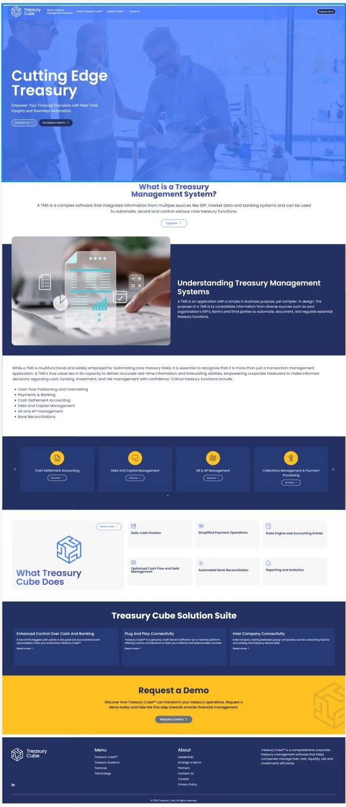
Before
After
DELIVERY & OUTCOME
A complete redesign in two weeks
The redesigned external website was delivered within the conference-driven deadline.
Key outcomes
Completed the website redesign within the two-week timeframe.
Established a clearer navigation and content hierarchy.
Reduced duplicated information in the proposed structure.
Produced Figma designs and interactive prototypes for stakeholder feedback.
Collaborated with development to bring the redesigned experience to life.
Live website: https://treasury-cube.vercel.app/
Note: These are delivery and design outcomes. No post-launch usability or conversion improvements were measured as part of this case study.
KEY TAKEAWAY
Effective UX design is not always about lengthy research. Sometimes it's about understanding constraints, organizing complexity, aligning people, and delivering a clearer experience through rapid iteration.
Case Studies

CRM Efficiency Redesign
UX Research & Design Lead
Helping representatives access member information faster during live calls.

Website Experience Redesign
UX Designer & Business Analyst
Simplifying site architecture and delivering an iterative redesign in two weeks.

Call Explorer
UX Lead
Making large volumes of customer service data easier to explore and understand.